March 20, 2020
Share via

#gettingstartedwith

Natural language processing (NLP) is a branch of machine learning that deals with processing and analyzing human language, both speech and text. Data visualization refers to a set of techniques used to present data in a visual format that is easier for the human brain to digest and detect patterns from. As the amount of data, including text, grows, tools for text processing, analysis and visualization evolve as well.

Let’s use stand-up comedy TV specials transcripts and NLP techniques to compare comedians. In this article, I will show that text analysis and visualization can be easy and fun and that with modern publicly available tools, everyone can do it, even without much programming experience.

To make this article a bit of fun, I chose open need open source data that is amusing to analyze. The idea of using stand-up comedy TV specials transcripts and NLP techniques to compare different comedians was inspired by this tutorial.

When this article was written (03/2020), the following stand-up comedy TV specials were among most popular in IMDB:

  • Dave Chappelle: Sticks & Stones
  • Hannah Gadsby: Nanette
  • John Mulaney: New in Town

Preprocessing

I scrape the scripts for the above mentioned programs from Scraps From The Loft, a digital magazine featuring movie reviews, stand-up comedy transcripts, interviews, etc. making them available for non-profit and educational purposes. Using publicly available tools, I try to first understand stage personas, words that are most characteristic of each comedian, and differences in word usage between comedians.

In the preprocessing step, I delete text within brackets that indicates interruptions by the audience (e.g. ‘[audience laughs]’).

				
					data_df['transcript'] =  [re.sub(r'([\(\[]).*?([\)\]])','', str(x)) for x in data_df['transcript']]
				
			
I then use Scattertext (Kessler, 2017), a publicly available tool built around scatter plot, an alternative to traditional techniques like ranking the most frequent words and word clouds.
				
					!pip install scattertext
import scattertext as st


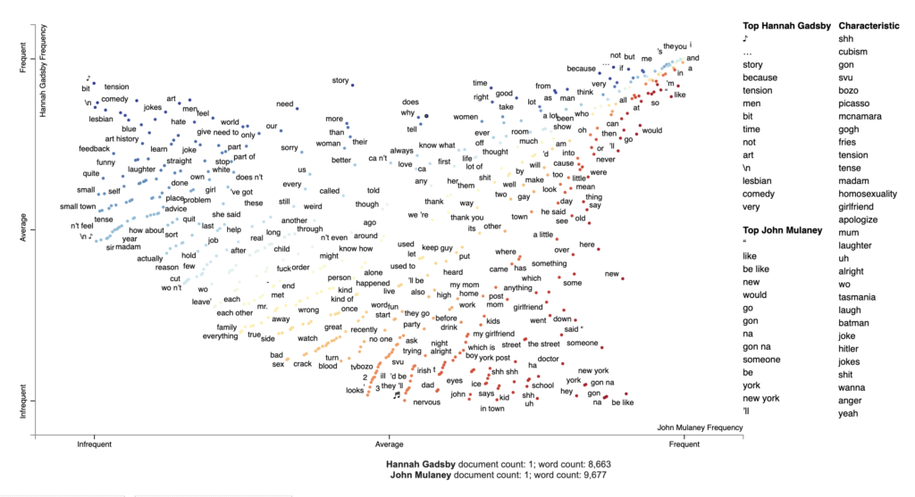
Visualizing corpora differences with Scattertext

To generate our first visualization, I follow the steps from the original tutorial.

				
					# chose the comedians to compare
pair1 = 'Hannah Gadsby', 'John Mulaney'
df_pair1 = data_df[data_df['comedian'].isin(pair1)]

# parse speech text using spaCy
nlp = spacy.load('en')
df_pair1['parsed'] = df_pair1.transcript.apply(nlp)

# convert dataframe into Scattertext corpus
corpus_pair1 = st.CorpusFromParsedDocuments(df_pair1, category_col='comedian', parsed_col='parsed').build()

# visualize term associations
html = produce_scattertext_explorer(corpus_pair1,
                                    category='Hannah Gadsby',
                                    category_name='Hannah Gadsby',
                                    not_category_name='John Mulaney',
                                    width_in_pixels=1000,
                                    minimum_term_frequency=5
                                    )
file_name = 'terms_pair1.html'
open(file_name, 'wb').write(html.encode('utf-8'))
IPython.display.HTML(filename=file_name)
				
			
With these few lines of code, I get a pretty neat text visualization.
Figure 1 shows an example of a Scattertext plot comparing Hannah Gadsby and John Mulaney transcripts. The coordinates of a point indicate how frequently the word is used either by Gadsby or by Mulaney. The higher a point is on the y-axis, the more it was used by Gadsby, and the further right a point is on the x-axis, the more it was used by Mulaney. Terms that are highly associated with one of the comedians occur in the upper left or lower right-hand corners of the chart, and stop words(most common words in a language like ‘the’, ‘and’ etc.) appear in the top right-hand corner. Words occurring infrequently in both Gadsby’s and Mulaney’s transcripts appear in the lower left-hand corner. Points colored blue are associated with Gadsby and points colored red are associated with Mulaney. By clicking on a point, I get statistics about a term’s relative use in both Gadsby’s and Mulaney’s transcripts and see extracts from the transcripts where that term occurs (Figure 2).
Let’s see some quick insights I can get from it.Mulanney uses the words ‘be like’ (and ‘like’) a lot… I was never like, “Oh, what’s it gonna be like when relatives ask to borrow money? And Gadsby uses ‘because’ nearly three times more often than Mulaney (199 per 25k terms VS. Mulanney’s 69 per 25k terms)… Very clever, because it’s funny… because it’s true.Mulaney is a nervous kind… Just too anxious for a lot of things, I get nervous all the time, not even about like major life things, just about like everyday situations. While Gadsby studied art history… You won’t hear too many extended sets about art history in a comedy show, so… you’re welcome. These demonstrate example topics that two comedians use in their materials.By the way, why didn’t I use Chappelle’s transcript to visualize terms associations? Well, there were just too many ‘terms’ to blurr…
David Chapelle in Saturday Night Live, 2016 (https://gph.is/2ePdMRF)

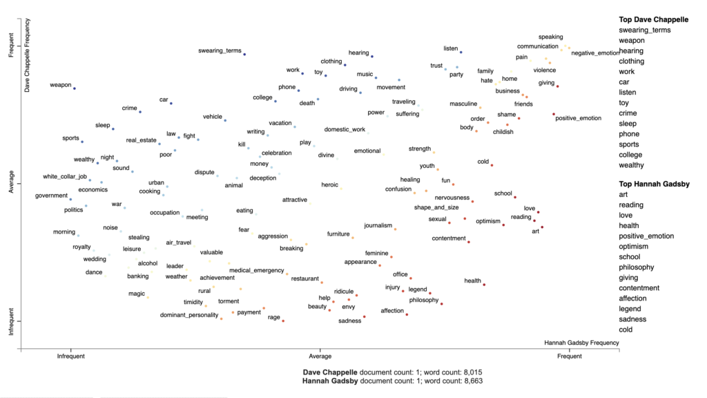
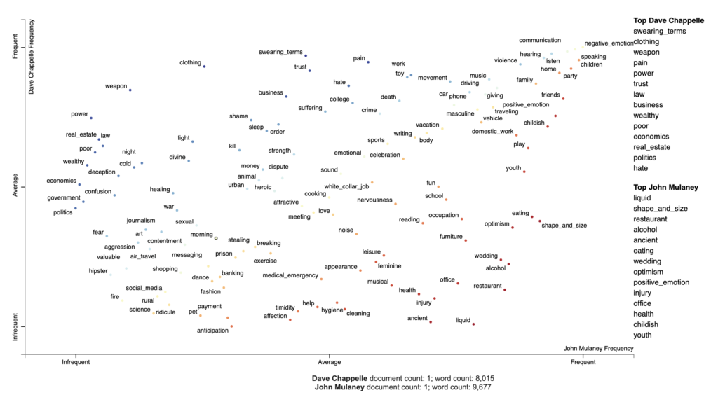
Visualizing topics using Empath

I use Chappelle’s transcript in the next example to visualize Empath topics. Empath (Fast et al., 2016) is a tool to analyze text across lexical categories (or topics) that can also generate new categories from text (e.g. “bleed” and “punch” terms generate the category violence). To visualize Empath topics with Scattertext, I install Empath, an open source Python library, and create a Corpus of extracted topics. I use the source code adjusting it for our data. The result is shown in the Figure 3.

				
					!pip install empath


					# chose the comedians to compare
pair2 = 'Dave Chappelle', 'Hannah Gadsby'
df_pair2 = data_df[data_df['comedian'].isin(pair2)]

# parse speech text using spaCy
nlp = spacy.load('en')
df_pair2['parsed'] = df_pair2.transcript.apply(nlp)

# create a corpus of extracted topics
feat_builder = st.FeatsFromOnlyEmpath()
empath_corpus_pair2 = st.CorpusFromParsedDocuments(df_pair2,
                                             category_col='comedian',
                                             feats_from_spacy_doc=feat_builder,
                                             parsed_col='parsed').build()

# visualize Empath topics
html = produce_scattertext_explorer(empath_corpus_pair2,
                                    category='Dave Chappelle',                                       
                                    category_name='Dave Chappelle',
                                    not_category_name='Hannah Gadsby',
                                    width_in_pixels=1000,
                                    use_non_text_features=True,
                                    use_full_doc=True,                              topic_model_term_lists=feat_builder.get_top_model_term_lists())
file_name = 'empath_pair2.html'
open(file_name, 'wb').write(html.encode('utf-8'))
IPython.display.HTML(filename=file_name)
				
			
Figure 3 shows a comparison of Empath topics extracted from Chappelle’s and Gadsby’s materials. The coordinates of a point indicate how frequently the topics appear in Chappelle’s or Gadsby’s transcripts. Chappelle’s most frequent topic (i.e. lexical category generated by Empath tool) is ‘swearing_terms’, and Gadsby’s is ‘art’. In the far upper right-hand corner, I see topics that are highly associated with both comedians. Among those are ‘negative_emotions’ and, what seems to be related, ‘violence’, ‘pain’ and ‘hate’. ‘Weapon’ and ‘crime’ are located in the upper-left corner being associated with Chappelle while ‘rage’ and ‘sadness’ are colored red showing stronger association with Gadsby. That being said, both TV specials seem to cover a wide variety of difficult topics…
Figure 3
If I create a similar text visualization for Chappelle and Mulaney (Figure 4), I still see ‘negative_emotions’ in the upper right-hand corner, although other categories like ‘violence’, ‘pain’, ‘hate’ are on the left side now. That means that now these categories are primarily associated with one comedian only (Chappelle). If I look at the topics on the right or the topics that are colored red, I do not actually see anything that could be intuitively categorized as ‘negative_emotions’.
Figure 4
Similar as before, I can click on the category (e.g. ‘negative_emotions’) to see excerpts from the transcripts and which words generate the category for each comedian.
 Associated termsExample
Chappelle’s corpora‘mean’, ‘die’, ‘care’, ‘kill’, ‘bad’, ‘wrong’, f-ing, ‘worst’, ‘dead’, ‘beat’, ‘alone’, ‘hard’, ‘reason’, ‘guilty’, ‘crazy’, etc.If you’ve been poor, you know what that feels like. You ashamed all the time. Feels like it’s your fault…
Gatsby’s corpora‘reason’, ‘bad’, ‘wrong’, ‘disappointed’, ‘beaten’, ‘mean’, ‘stop’, f-ing, ‘hit’, ‘confused’, etc.And I am angry, and I believe I’ve got every right to be angry! But what I don’t have a right to do is to spread anger…
Mulaney’s corpora‘crazy’, ‘worth’, ‘terrible’, ‘wanted’, ‘lie’, ‘blame’, ‘killed’, ‘wanted’, ‘alone’, ‘lost’, ‘stupid’, ‘mean’, ‘bad’, ‘confused’, ‘fault’, ‘terrible’ etc.When people get mad at me now, it’s my fault, when people get mad at me on the highway that’s all my bad, I’m a terrible driver, I know nothing about cars.  I meant to learn about cars, and then I forgot…
John Mulaney: Kid Gorgeous, 2018 (https://tenor.com/3bVP.gif))

Did this quick text visualization analysis help you decide which stand-up comedy TV specials to check out on Netflix tonight?

#gettingstartedwith is our new blog series for those of you that are eager to get acquainted with data and AI.
Curiosity is in our core, and many DAINians are constantly experimenting on things. We owe it to our customers to stay on top of new technologies, and to be honest, being a bit on the nerdy side, it comes quite naturally! Taking time to learn is also something we as employers want to encourage, and make sure some time is reserved each week for sharing knowledge with co-workers.
The blogs and posts we publish with the #gettingstartedwith tag will be more of an introductory level for those of you that want get familiar with the world of data and AI. It may be tips and tricks, showing how to build an API in 60 minutes, or a fun project on experimenting on text analysis for instance. Or we may be sharing links to good reading or watching, e-learning available or people to follow.

References & more

Kessler, J. S. (2017). Scattertext: a browser-based tool for visualizing how corpora differ. arXiv preprint arXiv:1703.00565.

Fast, E., Chen, B., & Bernstein, M. S. (2016, May). Empath: Understanding topic signals in large-scale text. In Proceedings of the 2016 CHI Conference on Human Factors in Computing Systems (pp. 4647-4657).  https://arxiv.org/pdf/1602.06979.pdf

Photos by Bogomil Mihaylov & Frederick Tubiermont 

Updated 31.3.2020 to correct a typing mistake and to add gif sources.

Written by Ekaterina Diachkova. She works as a BI developer (working student) at DAIN Studios (management consulting). She has 3+ years of experience in BI and data visualisation and present interest for AI and Natural Language Processing.

Details

Title: Text Visualization of Stand-up Comedy with Scattertext
Author:
DAIN Studios, Data & AI Strategy Consultancy
Published in ,
Updated on April 21, 2021