Any business organization must constantly respond to changes in their operating environment. Measure the change, predict the implications for you, and adapt – simple as that. In practice, no matter how data-driven you are, measuring the right things in a new situation can be challenging, and often new data sources and approaches are needed. Collecting data from internal and external sources, building decision-support dashboards and machine learning models with customized user interfaces can be a few-month job for a sizable data team! If the change is sudden, you need to react quickly, – but when the impact is uncertain, launching a large-scale development project might be an expensive overreaction. In this post we applied a fast data app prototyping tool, Streamlit, on exploring revenue impact scenarios in the “new normal”.
The Cost of COVID-19
For COVID-19, there are a number of dashboards available for monitoring every aspect of the pandemic. About the most famous one developed at Johns Hopkins, it was particularly impressive how quickly the creators were able to find and aggregate all the data sources when the virus began to attract public interest (they were professionals before it was cool). A global dashboard, however, is hardly actionable for most organizations. How do we gain relevant insight from this abundance of data for, say, a major European retailer?
The publicly available, high-quality data collected for the above mentioned dashboard seems like a good starting point for this purpose as well. We could also utilize regional mobility trends, e.g. by Google (available for the time being) to better understand current consumer behavior. It would be nice to present the interesting parts of the data together with some internal company data, so maybe we should build data warehouse pipelines and modify existing sales dashboards, or make new ones, . and pPerhaps we would also like to have our data scientists exploring and building machine learning models for supporting difficult decisions and automating simple ones with this up-to-date data. On second thought, maybe just look elsewhere, wait out the pandemic, and hope the company is still standing after the dust has settled? With Streamlit, you can deliver all this before the need to commit to any significant investment – no return calculations necessary.
Enter Streamlit – Tool for the Python Data Specialist
Released a few months ago, steamlit.io is an open-source app framework for building an ad-hoc fast data app “in hours, not weeks”. Streamlit essentially turns a Python script into a responsive web app that you might think was custom-built with a modern front-end framework, all with very little added effort. To create an interactive front-end widget for controlling a variable, just wrap it in a Streamlit call. Caching the result of a data pipeline or an expensive computation only takes a Streamlit decorator. Advanced caching and hot reload make Streamlit scripting as fast-paced and addictive as front-end development, even when working with fairly complex data apps. When you need an interactive interface instead of an API, a notebook does not quite cut it, but a custom full-stack web app would be too much, Streamlit might be just what you need. Attractive use cases include interactive data exploreationsrs, quick machine learning app prototyping, and what-if tooling to reduce iteration between business stakeholders and data developers.
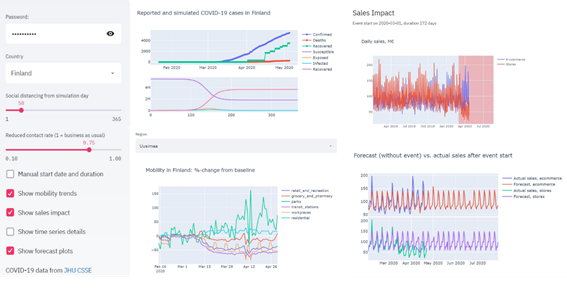
To model the sales impact of COVID-19, we can hop on the citizen epidemiologist bandwagon, and implement a simple model to simulate the susceptible, exposed, infected, and recovered (SEIR) fractions of the population in the region of interest. With data on actual confirmed cases available, we can approximate the current date in terms of simulation days, while adjusting the duration and magnitude of social distancing (reduced disease transmission), as appropriate given the emergency measures of the local government at the moment. With regional mobility trends, we can estimate the reduction in consumer retail activity, and adjust the timeframe of our anomalous event (with case-specific start/end definitions) accordingly. Finally, we can fit a time series model to our sales data prior to the pandemic and estimate the revenue impact for the expected duration of the event e.g. separately for retail stores and ecommerce. Here we used Prophet to readily model e.g. seasonalities and national holidays, but in simple cases reasonable estimates could be achieved by only looking at linear trends and constant intervals. With a single pure-Python script, we end up with the estimated sales impact for user-selectable region of interest, adjustable social distancing effects, and lovely browser-UI responsivity due to cached data pipelines and computation – all in a day’s work without even bothering our busy front-end professionals.
Final thoughts on a fast data app
The above impact calculator barely scratches the surface of Streamlit, which works seamlessly with deep learning models as well. To entertain your bored family at home, for instance, add about 30 lines of Streamlit code to a neural style transfer script to magically turn it into a web app on your idle gaming PC personal GPU-workstation that a kid with a phone can use to make family photos look like they were painted by renaissance masters. There are various tutorials and demos available to get started with Streamlit, one of our favorites being the neat GAN face generator that now also runs on “The Kraken” at our office to hopefully cheer up the occasional quarantine-escapee. If you prefer Docker, you can try our image instead with docker run –gpus all -p 8501:8501 ahtonen/demo_face_gan:latest.

These office mates don’t exist.
Written by Juho Kerttula. Juho is a Senior Data Scientist at DAIN Studios, based in Helsinki.