At DAIN Studios, we are researching how artificial intelligence can be ‘explained’. We opened the Explainable AI (XAI) article with an introduction to XAI and what we can expect from it. This article looks deeper in what XAI types of methods are available using practical examples.
During the last decade, the general interest in XAI has increased fueled by the progress of AI, particularly modern complex AI methods such as deep learning that are naturally hard to explain.
Many XAI methods show good results in laboratory tests, but few have been deployed to production today. As more use cases are developed and more experience is gained with XAI research and development, we can expect that XAI will be a standard part of building and deploying more complex AI models. We will examine here the state of the art XAI methods and their potential applications.
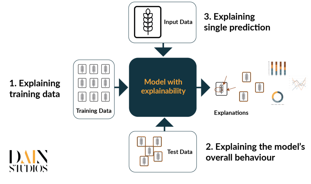
We will focus mainly on an image classification problem where each image belongs to one class. The goal is to use supervised training to create a model that predicts the class labels of new, unseen data. Image classification is typically done using deep neural networks. Deep neural networks use multiple layers to progressively learn features from the raw input. With these kinds of classification problems, explainable AI can be divided roughly into three different categories (Figure 3):
- In supervised learning, the model is trained with pre-labelled data so in the training phase, a set of images are fed to the model and the model tweaks its parameters until it learns to classify the images as correctly as possible. As the model parameters are tweaked with the examples in the training set, the training data has a big impact on the accuracy and reliability of the model predictions. To understand the model, we need to understand the data used to train the model first. Typical questions we try to answer are about the quality and quantity of the data and its representativeness on the problem we are trying to solve.
- Explaining the model’s overall behavior. Once the model has been trained, it is important to carefully evaluate how it is performing. Calculating accuracy in the test set is a very common step but often we would benefit from more careful analysis of the model mistakes and biases. The better we understand the model, the easier it is for the model developers to fix the problematic parts and improve the overall model.
- Explaining a single prediction. When the model is being tested or in use, the user will feed one image to the system at a time. Then the model predicts its label and calculates its classification score. Ideally, the prediction is correct but even the best models fail at times. Users might be hesitant to trust the model’s prediction if there’s no reasoning behind the prediction. Thus providing explanations for each prediction makes it easier for the users to trust the model and check that the model is focusing on the correct parts of the image.
We take a closer look at each of these categories below.
Explaining the training data
Training is the phase during which the AI learns the model for the classification. The quality and quantity of the training data have therefore a big impact on the model: if there’s little data and/or the data quality is low, the model’s learning capabilities are limited. Moreover, the model can easily inherit biases of the training data. For this, it is fundamental to thoroughly understand the training data to understand the quality of the model.
Typically, when we start a new project or we get some new data, we want to visually inspect the input data, quantify possible biases and its quality. However, in the case of image classification, we usually need a large number of images to train the AI and visual inspection of all of them is not a possible way to go. Instead, we could randomly choose a subset of images. But this would make the characterization of the input material dependent on the subsample chosen. In general, a random set does not necessarily cover the whole data space if the data varies a lot, we cannot be sure, which are typical cases for some classes and which ones are rare instances.
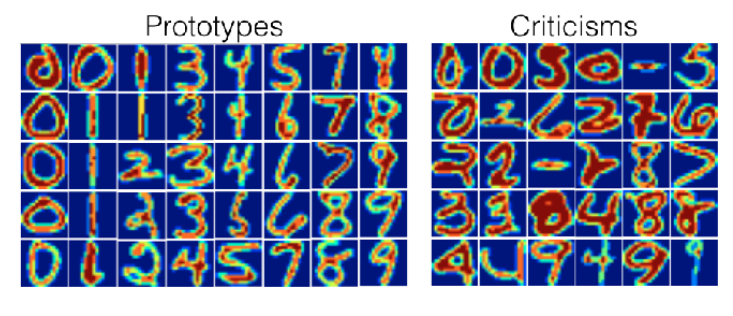
For this reason, the concept of “prototypes” and “criticisms” was created. The idea behind the prototypes is that a smaller dataset covers the whole data space sufficiently. With the prototype images, one can easily see what kind of images are present in the data. But the prototypes are not often enough as there might also exist outliers i.e. images that are not well captured with prototype images. Model criticism samples portray these rare cases, and together with the prototype images, helps the data scientist to build a mental model of the data space. In figure 2, we show some examples of prototypes and criticisms for the case of handwritten numbers that were selected with a statistical MMD-critic method.
Explaining the model’s overall behaviour
Accuracy is an important metric when ranking different models. But accuracy does not tell you where the problem areas are: some mistakes are more serious than others. Therefore, carefully testing the model using statistical methods helps in understanding where the model works and where it fails. Testing increases trust towards the model. Important questions include “How often does the model make mistakes?” “In which situations the model is likely to be correct/incorrect?” and “Are there unwanted biases in the model?”
On top of that, examples are a good way to understand the model. A method called adversarial prototypes and criticism select examples that are typical and atypical for the particular class not only as general examples of the class (as discussed above) but in particular from the model’s perspective. The idea behind is similar to adversarial attacks: modify the images a bit such that you try to make the model flip its prediction. If only after a few modifications to the image the model flips its prediction, then the image is considered as weak of that class. Similarly if, after multiple small changes to the input image, the predicted class doesn’t change, it’s considered as a strong example of that class. In Figure 3 you can see examples of this method with the “banana” class. The top row contains examples of strong cases of bananas according to the model ie. prototypes. The row below represents weak cases of bananas ie. criticisms.

Explaining a single prediction
Once a model is ready for test use or in production it is helpful to understand why the model gives a certain prediction. This “single prediction” use case is important both for verifying the model is working correctly, but also for creating trust in the prediction for the users of the system. Especially if you disagree with the prediction, it would be helpful for the user to give further data that explains why the AI has given the prediction. With this additional information, the user may notice details that she has missed, but AI was able to spot them.
For image data, a common way to explain the prediction is to highlight those pixels that have the highest impact on the model prediction and those pixels that mostly opposite the given prediction. An example of a single prediction is the “Naama” system that was described earlier (How to make Artificial Intelligence more Transparent): the explanations highlight those regions of the face that were the most important for detecting the person’s sentiment.
But the pixel-based explanation method used in “Naama” was just one method among many others. There are dozens of methods that each have different pros and cons. The way the XAI layer does the explanation depends on the use case and what data is used.
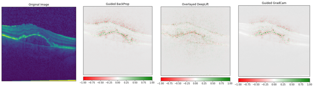
Using a medical image as an input image, a comparison of XAI methods are shown in the image below. It is noteworthy to mention that with medical images, the details that the AI model should spot are often so small that some of these methods are out of the question simply because their result is too vague for this purpose (but they might be great for explaining the “cat” prediction from the image).
The above image is very interesting to us, as we are using the same data set to build our own XAI demo. The data set consists of Optical Coherence Tolerance (OCT) images of the retinas of living patients and each image belongs into one of the four classes: normal, CNV, DME and DRUSEN. The three latter classes are diseases that are the most common causes of blindness. The data set is open-source, it contains a good amount of examples (in total about 84 000 images) and the images are collected from different clinics around the world between 2013 and 2017. Before we applied any xAI methods to the images, we trained a model that predicts the label of the image. We were able to achieve very good test set accuracies when we evaluated the model’s performance with unseen images.
To experiment with the different types of pixel-based explanations, we found a package called Captum. It is a very easy to use package and it contains multiple different pixel-based explanations. In the medical image XAI example, we showed above, we chose some of the best-performing methods for our tests. In the image below, we show our model explanations with the top three methods we found. Based on the explanations, we can see that our trained model can detect the fine details from the retinal image that are required for the prediction.
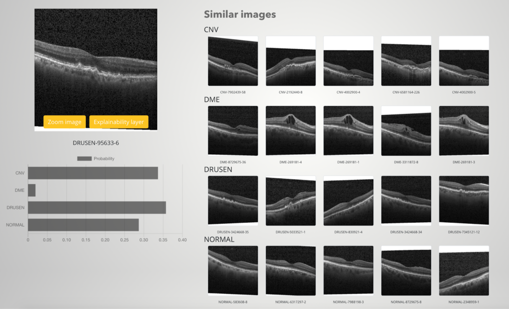
Besides pixel-based explanations, we wanted to implement some other single prediction methods to our XAI demo as well. We are especially interested in showing some examples of the classes the model predicted. But we don’t want to just print some random examples that the user can compare with the query image. Instead, we hope to find as similar examples to the query image as possible. For this we use “image embeddings”: we choose one of the last layers of the neural network, and compute the calculations up to this layer. We do the same for each training set image to create a data pool we compare our query images with. The idea is that similar images should have similar image embeddings.
Below we show an example result of this method from our XAI demo. Notice that intentionally we chose a query image that the model was not sure about: the predictions score to three top classes are quite close to each other so the user has to decide whether they trust the result or not. And as seen from the similar examples, it is not that easy to label this image as similar types of images can be seen in three different classes.